
This blog now lives at our main site, juliareichdesign.com. Come visit us there!

Hate your logo? Figure out if it can be fixed, or if you need a new one.
Do you love your organization, but hate your logo? Would you love to change it, but you’re not sure what to do, how to talk about it, or know if you can afford it?
You are not alone.
Bad logos are a common nonprofit affliction. Maybe it was drawn twenty years ago. Maybe you started with clip art. Maybe you lost the original files and are using a version that looks like it has been faxed thirty times. Maybe you just flat-out don’t like it, whether you know why or not.
It’s OK. We’ll get you on the path to logo recovery!
Presented Live on
Wednesday, February 8, 2012
1:00 – 2:00 p.m. Eastern
(10:00 – 11:00 a.m. Pacific)
During this webinar, our favorite design expert, Julia Reich, will
- Elevate your knowledge of logo design, so you know what makes a good logo and what makes a bad one
- Look at lots of logos with us, and discuss why they work and why they don’t so you can put the theory into practice and have examples you can discuss with others
- Give you the ammunition you need to evaluate your logo and intelligently discuss it with your colleagues
- Help you see if you can get away with a quick fix versus a total logo overhaul, and what each process entails
As an added bonus, Julia will review the logos of several participants live on the webinar.
It’s important for an organization to have a strong logo, since it helps you create a consistent look that reinforces your mission, increases awareness, and attract donors. We will help your logo go from sucky to successful!
Julia Reich of Julia Reich Design will present this webinar. Kivi Leroux Miller, president of Nonprofit Marketing Guide.com, will moderate your questions for Julia.

This is Part 2 in a series of posts that I have been sharing share with the http://www.nonprofitmarketingguide.com/ community, about how to hire a graphic designer or design firm.

……
In my last post, “How to Hire a Graphic Designer or Design Firm, Part 1: Where to Look” I offered suggestions on where to turn to find designers to work with.
Assuming you’ve found some likely candidates, how do you narrow down your choices? I’ll cover what to look for in an independent designer or design firm so you can pick one with a sensibility and methodology (and pricing) that’s a good match for you and your organization.
Look & Feel
Aesthetics are surely subjective, but there are some standards that apply across the design discipline. In reviewing creative portfolios (which should be easy to find on any firm’s website), look for work that is accessible, straightforward, impactful, and memorable. Avoid trendiness. It should look in line with the current times, but also project into the future 5 or 10 years – do you think the work will be visually relevant then, too?
Media, Industries, and Sectors
When “shopping” for a designer, it’s typical to want to find someone that’s done the exact same thing you need. However, a proficient designer/design firm should be able to work on a broad range of projects. For example, if you need to have a website re-designed, but a colleague at another agency recommends their logo designer, ask the designer if they also do what you need, and look at samples of their work.
A good designer can be just as creative working with an organization in, say, the health care sector as they can in the performing arts for example. As long as they are curious and exhaustive in really getting to know you – by asking questions, talking to stakeholders, and researching your organization – don’t discount them right off the bat if you don’t see exactly the same kind of piece you’re looking for, or past clients that are similar to you, in their portfolio. In fact, sometimes it’s better to find someone that does not work within your field, so your designer comes at your project with a fresh, open approach.
I DO highly recommend finding a designer that works primarily within the nonprofit world. Not only are nonprofit needs unique from your corporate counterparts, but the culture and personality at nonprofits is different. Your designer should have the kind of expertise in creating materials that typify the nonprofit sector, whether that’s communicating diverse messages or designing campaigns that increase donations and awareness.
Finally, if you are looking for a logo design, there are a lot of designers who are highly talented doing this kind of creative work. But if you are looking to undertake a full-scale strategic branding project, take note of designers and firms which clearly state that they offer this service, and have the case studies and testimonials to back it up.
A Quick Note About Designers vs. Developers
When it comes to website projects, designers are not the same as developers. Designers, who are typically responsible for the aesthetics of a site and maintaining your brand online, do not always make great developers, and developers, who are typically responsible for the site’s functionality, can be terrible designers (of course, this is a generalization, and you could very well find talented individuals whose left and right brains are equally robust).
If you hire a solo designer, be aware that they may be partnering with another individual to do the development. This is a good thing, since each person on the creative team is doing what they do best. Ensure your designer is the main point person. If s/he is able to manage workflow and facilitate communication between yourself and the developer for the duration of the project, you should be in good hands.
Many firms are full-service operations, and can create your entire website from concept through completion. See if they have both designers and developers on staff. In either case, check out designers/design firms online portfolios – do you like their designs? Do the sites they create offer the kind of features and functionality you’d like for your site? Are you able to move around their clients’ sites easily, and is the experience enjoyable?
Read more here about designers vs. developers, and why knowing the difference can ensure a successful site.
The Interview
Arrange for three to five designers to visit for an in-person meeting to discuss their work and your project. Whether the designer chooses to display their work in an old-fashioned portfolio with hard copies, online, or using a PowerPoint presentation, here’s some tips on what to ask and look for:
- Is the work consistently strong, and in a style that resonates with you and the personality of your organization? (strong = accessible, straightforward, impactful, and memorable)
- Ask about the challenges inherent in each project, and how the client articulated what they needed. How successful was the solution the designer came up with? Are there quantifiable results, or client testimonials? Listen carefully for articulate and informed answers. Be aware of work that is pretty to look at, but does not solve the client’s unique problems.
- Find out if the work you are viewing was actually approved and produced/printed (good!), or if it is student/personal work (red flag alert!).
- Ask what the designer’s role was in each project. Look for someone who can manage an entire project from concept through completion, and work with a printer or developer to ensure quality control for the duration.
- Ask the designer to explain their process. You should come away from the meeting with a clear understanding of each phase, what the deliverables are and how they will be presented, how many rounds of revisions you’ll get, and what they expect you to provide/do.
- Be prepared to explain the full scope of work so the designer will be able to get back to you with a price estimate and/or proposal.
That Certain… Je Ne Sais Quois
Other than creativity and expertise, your designer of choice should be intelligent, inspired, and responsive to your needs. You should feel comfortable – not intimidated or awkward- communicating with them. Ultimately, a successful project – whether it’s a logo, brochure, or website – will be the result of a designer/client relationship with mutual rapport and respect.
Julia is Principal of Julia Reich Design, which helps nonprofit organizations bring their mission to life with award-winning brand strategy, graphic design, and web design services. Clients love her team’s top-notch creative work combined with an affordable, personalized approach.
![]()
When an Upstate NY organization revolutionized its strategy in order to stay on mission, we jumped in to help.
With a new executive director, new office space, and a new strategic plan, the Cayuga County Chamber of Commerce needed a newly imagined logo to let everyone know that things had changed.
In our Discovery Process, we learned that the Chamber’s constituents saw it as a social organization. But it’s really an advocacy and business development organization.
So we looked for active, bold, businesslike images, and avoided anything passive, soft, or pastoral. Our three suggested designs focused on three concepts: “Voice of the Business Community,” “County-wide Reach,” and “Collaboration.”
The Chamber went for “Collaboration.”
Our inspiration for that design came from the executive director, who told us that “the Chamber is the cog in the wheel that sets the business machine in motion.” That image set our imaginations in motion!
In the design, each wheel represents one of the three Cs of Cayuga County Chamber. The central “C” shows the Chamber at the dynamic center of things. And we chose a strong “Neutraface” font to mirror the circular shapes in the logo.
The bright, multi-color palette reflects the energy of the Chamber’s diverse membership, as well as the area it serves. Blue for the water that brings tourists to the Finger Lakes, green for the beautiful farms and forests, and oranges and yellows to illustrate the vigorous arts and culture of the area.
That beauty and energy now appears in the Cayuga Chamber of Commerce logo.
(this article first appeared on Kivi’s Nonprofit Communications Blog on October 5, 2011. This is Part 1 in a series of posts that I will share on Kivi’s blog about how to hire a graphic designer or design firm.)
….
If you’ve never worked with a designer before, the task can seem daunting. I’ll try to demystify the process.
Intro
You may have just completed a strategic planning process, and are ready to hire a designer to overhaul your entire communication system with a newly refined vision and mission. Or you may have a discrete project on hand – a website, annual report, or logo design. Either way, the time has come to find the right person or firm for the job. How to find one that’s a good fit for you?
Where to Look
1. Referrals from Colleagues You Know
If you see work you admire being done for another organization, be direct and ask who they use, and if they would recommend that person/firm. In my experience, colleagues are happy to refer consultants and vendors they know, like, and trust.
Jana Byington-Smith, Executive Director of Camp for All Kids and President of Second Gift, adds, “I also look for firms that work with clients repeatedly. I think this is an indicator of the ability to develop a good relationship – quality of relationship over the number of clients.”
2. Referrals from Colleagues You Don’t Know
There are several listservs and other groups serving the nonprofit community. One of my favorites is The Progressive Exchange, a helpful online community with over 8,000 members, whose goal is to “aid the online efforts of progressive causes, campaigns, and organizations”. If you seek help finding a web designer or developer firm, this would be a good place to post a query.
3. Online Portfolio Sites
These are sites where you can look through many different designer’s portfolios, and in some cases, post a job or project listing.
Behance is a highly visual portfolio site for all types of creatives. While you can narrow your search by various creative fields, alas, “nonprofit design” is not one of the search criteria.
AIGA, the professional association for design. You can search the Designer Directory by clicking on “Find a Designer” in the top right corner of the home page, which leads you to a listing of designers and links to their own websites. Any designer you find here is likely to uphold the group’s high standards. But be aware, some of the portfolios listed in the Jobs section could be students or recent grads, so if you prefer someone with more experience, tailor your search accordingly.
Creative Hotlist easily allows you to seek designers by location, category, and experience, or via any words you enter in the ‘search’ field.
4. Google Search
While this may sound obvious, a key word search in Google may yield positive results in finding a design firm that has expertise in your niche. Graphic design is a highly competitive field, and firms are willing to spend time & money to come up high in page rankings that are highly relevant to your search terms. Try making your search terms as specific as possible, avoiding generic search terms like “logo design”. We had one prospect find us recently by searching “New York web designer local food”. She found us because one of things we’re passionate about is working with clients who promote good and local food, nutrition, and healthy food systems – and Google found us.
5. Post an RFP
This is one of the standard ways that clients look for business partners. You post a Request for Proposal on your own site, or one like the RFP Database, and sit back waiting for the proposals to come flooding in. If I sound cynical, that’s because I think the RFP process is outdated and should be done away with. Why? From the designer’s point of view, most RFPs are not written thoroughly enough for the designer to be able to adequately respond.
Plus, wouldn’t it be better to garner responses from firms you have a relationship with already, or, if you don’t have any designer relationships, than referrals from people in your field that you trust and admire? If you’re still in the dark, look for proposals from firms that make an effort to establish personal contact and get to know you better, and your group’s unique needs. This could be a simple phone call or request to meet in person.
Your designer should be your strategic partner, working in collaboration with you to get to know your personality, goals, and challenges. If the project scope allows, they should be talking to your board, interviewing donors, and observing your communication processes. Let them make recommendations as how best meet your goals and overcome challenges. Designers learn more during the discovery process than could ever be encapsulated in an RFP, no matter how detailed.
If you insist on persisting, then it helps to write a good RFP. I recommend Nancy Schwartz’s article, 8 Ways to Craft a Communications RFP Process that Works.
Where Not to Look
A brief note about a) the crowdsourcing trend, and 2) its evil stepsister, design contests. Don’t go there, and don’t do it! A lot has been written about this, so I don’t want to dwell in too much detail (or, perhaps I will in a future post). In brief, both of these concepts ask designers to work for free (“on spec”) by submitting designs that may not get chosen, and only getting paid for those that do, which is why crowdsourcing and contests are considered by many to be exploitative. This undermines the design profession and the value we bring to our relationship with our clients, while diminishing the quality of work you receive. Learn more here and at the NoSpec! site.
Once you’ve found some likely candidates, how do you narrow down the choices? In my next few posts I’ll cover what to look for in a designer/design firm, what to ask at the interview, and what to expect from your relationship once you’ve made a decision.
There’s a little game going around facebook right now where someone gives you a numerical year, and you write a post on what you were doing that year. This story is about 1990 – the summer of 1990, between my sophomore and junior years of college. I was 20 years old, more than half my lifetime ago.
First I need to tell you a little about the college I went to, Hampshire College in Amherst, Mass. It’s an “alternative” school, meaning the academic system is different than most schools. There is no credit system, and no grades. In fact there is no “freshman”, “sophomore” etc status. Schoolwork was completed by a “Division” system – I, II, and III. Div I was an introduction to the main academic disciplines. Div II was akin to choosing a major. Once I chose my major, I documented it with a portfolio of classes, papers, internships, and other scholarly pursuits that supported it. Div III was similar to a thesis year, where I chose one specific aspect of major to pursue in depth.
My field of interest was ‘environmental education’. Without getting into the specifics of my plan, I can tell you that as I approached my junior year at Hampshire I was worried about what my Div III thesis would be. It had to be something big, big enough to spend an entire year researching and writing. I saw other students at Hampshire during the their Div IIIs doing all this amazingly creative stuff, way beyond what most college students did at the undergrad level. I loved everything about environmental education – the kids I worked with, being in nature, learning about nature, teaching it – but I still did not know what my big Div III project would be. The pressure was on.
This is where the second character of my story comes in, lets call him Larry. Larry was a friend who lived in the area but was a little older than college age. He was an environmental activist and former environmental educator. Truth be told, he was more than a friend. We had an off again, on again romantic relationship.
We were in an “off again” phase when he came up with a great idea earlier that spring in 1990. It sounded like an adventure, a fun way to spend the summer outdoors, and would be excellent fodder for my Div III thesis. It was the kind of big crazy project that Hampshire students came up with all the time. We called it “Trekkin’ Turtle Island”, and here was the plan: We (Larry and I and some of his friends) would hike the Appalachian Trail all summer. Not the whole thing, since we just had 3 or 4 months, but the New England portion, from Connecticut to Maine. We wouldn’t rush, and it wouldn’t be just a recreational hike. It would have an environmental activism and education mission.
We researched environmental issues along the AT corridor, and decided to focus our message on wildlife- extinct or endangered species native to the areas we were passing through. We’d talk to hikers we’d meet along the way about these environmental problems and challenges, thereby educating people and bringing attention to the issues. Maybe we even created petitions to obtain signatures and later mail to legislators. Frankly, I don’t remember the details.
In order to spark conversations, we decided each one of us would pick a species and dress up like that animal. If I recall correctly, there was a timber rattlesnake, a lynx, and a wolf. Realistically, our costumes couldn’t be too complicated since we’d be spending all day, every day hiking for miles upon miles. I think I was the rattlesnake, and my costume consisted of a sturdy baseball cap with a hand-sewn, stuffed replica of the animal attached to it in front and back. Then, in an effort that pre-dated my graphic design pursuits by at least 10 years, I created an illustration in black and white with those three animals, underneath the arched title of our project, ‘Trekkin’ Turtle Island’, which I had silkscreened on dozens of brightly colored heavy-duty T-shirts. We wore those shirts while hiking, and think we also planned to sell them as a fundraiser to cover the costs of our trip. Then I designed brochures on speckled recycled paper that described our project’s mission, to distribute along the way.
We called it “Trekkin Turtle Island” because according to Native American Iroquois lore, the earth was created on the back of a giant turtle, and thus ‘Turtle Island’ is their name for North America.
Our project was well-conceived and well-organized. We wrote to outdoor equipment companies requesting sponsorship and donations. We even got a small grant from the Earth First Foundation. We bought our maps and guides, backpacks and other gear, planned the trip, where we’d arrive when, when we’d need re-supplies, and then shipped food to post offices at those places so food would be waiting for pickup. I planned to keep a detailed journal of each day’s events, who we met along the trail, and what we discussed.
The core hiking team consisted of myself, Larry, and another outdoorsy young woman named Ann I did not know well, an environmental activist from Geneseo, NY who had somehow heard about our trip and was keen to participate. Other friends would drop in along the way and hike with us for a day or two and then return home. We departed from southwestern CT in late spring and headed north along the Appalachian Trail.
The days took on a steady routine – hike, eat meals, find swimming holes, more hiking. Nights were spent at established AT shelters along the way.
I wish I could say the trip was a resounding success, but it was not. Almost immediately, Larry developed an attraction for our female hiking partner. Even though he and I were ‘just friends’ at this point, it was very awkward. Soon – very soon – friendly interpersonal communications deteriorated, and all three of us felt we were on a forced march rather than a fun adventure. Larry and his new friend decided to leave the trail and abandon the project. I didn’t know what to do. I had no other plans that summer, having invested so much time & energy into this one. I decided to keep going, solo. I figured there were many people on the trail during the warm summer months and I’d soon meet fellow hikers and make new friends.
As it turned out, after about two weeks of this, I was lonely. So I gave up and left the trail in the Berkshires of western Mass. I spent a day wandering around Great Barrington deciding what to do. Trekkin’ Turtle Island was over. It had failed. Miserably. Disappointed and disillusioned, I was probably not in the best frame of mind, and decided to hitchhike to Burlington VT to stay with my college friend Susan for a few days. Please don’t tell my mother about this last part.
Fortunately I arrived safely, and the summer was still young. My friend Joe got me a job as a camp counselor on a dude ranch in Prescott AZ, and thus it turned out to be an interesting summer after all.
I went back to college in the fall, and for my Div III, eventually decided to write an environmental education curriculum for middle school students on Native American culture and lore of the local area, combined with a documentation of my teaching work at a local Audubon nature sanctuary.
I graduated from Hampshire College in 1992, and after doing the nearly-obligatory drive across the country with my friend Jessica, returned to western Mass. and moved to a commune, er, ‘intentional community’ called Earthlands in a rural part of the center of the state, where I was to head up a blossoming educational program. But that’s a story for another time.
Join Business CENTS and Julia Reich, Principal of Julia Reich Design in this new workshop designed with Nonprofit organizations in mind!
Business CENTS and Julia Reich, Principal of Julia Reich Design presented this new workshop on Wednesday, July 27, 2011, designed with Nonprofit organizations in mind.
Our workshop objectives were to:
• Learn what branding is
• Understand how a strong brand can benefit your nonprofit
• Learn about the process of creating a strong brand
• Evaluate your organization”s name, tagline and logo
Key Takeaway: A strong brand can help you create a consistent look that reinforces your mission and attracts donors.
Below are some of the Resources and Case Studies we shared and discussed.
 |
Kivi’s Nonprofit Communications Blog — Written for do-it-yourself nonprofit marketers and one-person nonprofit communications departments.
This guest post by Allison Monnell demonstrates not only the power of storytelling in nonprofit communications, but just how beneficial it can be to your nonprofit when you integrate a culture of story sharing into your everyday work, as the Chemung ARC has done with its Stringer Success Stories.
|
| Creating a Strong Nonprofit Brand | Nonprofit Marketing | Getting Attention
© 2002 – 2011 Nancy E. Schwartz. All rights reserved. You’re welcome to "reprint" this article online as long as you do not alter the article in any way, and you include the author byline and attribution as displayed below. If you would like to edit the article, please contact us.
|
 |
Nonprofit Brand Institute
Council on the Environment of New York City Gets New Name and Logo to Improve Recognition The Union Square Greenmarket – the largest and most successful open-air farmers market in the country – is a New York City icon, but few people are aware that this and all greenmarkets in the city are programs of the 40-year-old Council on the Environment…
|
| Resources | Big Duck
Think of this as your own communications resource library. As much as we may want to, we can’t work with every nonprofit out there. But even those we don’t work with directly can benefit from some of Big Duck’s free (or inexpensive) nonprofit communications resources.
|
 |
What Does Your Business Card Say About You?
Hopefully you already have a business card, but if you don’t you should definitely create one. Business cards are something that we take for granted when we shouldn’t. The look, feel, and message on a card help people determine how they view you and more importantly, if they will even remember you.
|
| Iraq and Afghanistan Veterans of America
In the News Here are some of today’s top stories and happenings at IAVA. Prefer to receive real-time updates about major stories and legislation that IAVA is tracking? Follow us on Twitter @IAVAPressRoom or subscribe at http://www.IAVA.org/DailyNewsBrief.
|
 |
Stanford Social Innovation Review: Ideas for Socially Responsible Businesses
Click here to see our most recent eNewsletter Taking Exception to Exceptionalismby Eric Friedenwald-Fishman Jul 26, 2011 We Should Expect Good Giving To Be Hardby Holden KarnofskyJul 25, 2011 Surdna CEO on Philanthropic Isolationby Aaron HurstJul 22, 2011 Debra Dunn – Stakeholders in Corporate Social ResponsibilityJul 08, 2011 Robert Proctor – Global Health Speaker SeriesJun 29, 2011 Bill Drayton – Promoting Social Entrepreneurship Among YouthJun 27, 2011 Nonprofit Management Institute 2011 …
|

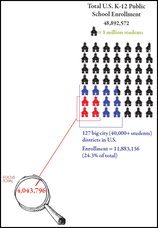
The Challenge
Our client, School Food FOCUS*, recently asked us to re-design this marketing piece. The reason for the re-design? They felt it was not adequately communicating the scope of what they do and who they do it for. Plus it’s just kind of homely. (By the way, I’ve eliminated non-essential text and graphics from the page to avoid visual distraction).
It’s a challenge to visualize data clearly, effectively and attractively. Comprehension is critical (We find the amazing graphic work at GOOD magazine is always an inspiration).
But first, we need to know what this organization does. What’s their mission? School Food FOCUS works with the largest school districts nationwide to advocate for school meals that are more healthful, regionally sourced, and sustainably produced. “FOCUS aims to transform food systems to support students’ academic achievement and lifelong health, while directly benefiting farmers, regional economies, and the environment.”
In studying the old graphic carefully (above), we could see that FOCUS is reaching a lot of kids in the country’s big city districts. But that was only part of the story this organization needed to tell. The new design also needed to visually represent the following core concepts:
- FOCUS works with many of the nation’s public school districts, including the largest ones
- A lot of these districts offer a high percentage of free and reduced lunches to needy kids
- The nation’s largest districts convey the strongest market pull
- This buying power affects how school lunches at public schools are procured
- FOCUS is successfully helping the most students in the nation’s neediest schools eat better
The Creative Process
Round 1

In this initial solution, we dispensed with the clip art schoolhouses and decided to break up the main messages using several graphics:
- USA map showing locations of participating districts
- Highlight the total number of students reached by School Food FOCUS in large point type
- Emphasize the high percentage of free and reduced meal eligibility rates within School Food FOCUS’s partner districts
Plus we took a stab at drafting copy for a main headline and sub-headlines, enabling the reader to put the data visualizations into context.
(Note: for this round and subsequent rounds, data and text does not represent final numbers and copy.)
Round 2

However, the “donut” graphics, 32 in all, proved overwhelming to digest, so we removed those. And there was a big ol’ typo in the title. Also in this round:
- On the map, we highlighted not only all the participating districts with a red dot, but also emphasized which of these were very large, with over 100,000 students, using a red dot within a circle
- Made further changes to the second part to try to convey more effectively that School Food FOCUS helps those children most in need of healthy lunches
- Added a photo
Round 3

In this round, we responded to the following client feedback:
- They liked the addition of a photo, but requested one where the child is not eating a banana, which is not sustainably sourced (oops!)
- In the graphic comparing the Free and Reduced percentages of FOCUS districts vs. the national average, the little people figures weren’t working too well, because they wanted to see something that showed more clearly that the two percentages are being compared to one another. So we developed this version using a lunch tray, where the data is together in one graphic.
……..
This project is a work in progress. As designers, we take pride in our creations that offer visual appeal. But is it functional? How successful have we been so far in communicating our client’s core messages? Has your organization produced a compelling infographic you’d like to share?
For more about infographics, with several great examples, see Smashing Magazine’s post on Data Visualization and InfoGraphics).
(*”FOCUS”: Transforming Food Options for Children in Urban Schools)
I was honored to be a guest post-er last week on Kivi’s Nonprofit Communications Blog. The title is Part II because Kivi had addressed the topic earlier in April, here.
……
I met Julia Reich at the NTC conference (at the 501 Tech NYC Happy Hour to be exact) and being the nonprofit marketing geeks we are, we started talking about the struggles that nonprofits face with design. We seemed to take a similar approach, so I asked Julia to guest blog for us. Her first post follows up on the discussion I started about style guides earlier this month by providing you with some real-life examples.
It’s not unusual that as an organization grows, your communication materials are created by various people. Before you know it, there’s five different versions of letterhead circulating around the office and your blue logo varies in shade from green to purple.
Consistency is Key. Inconsistency can be a problem. It’s crucial for a nonprofit to not only communicate their message clearly – what they do, how they do it, and who they do it for – but also to represent themselves visually in a consistent manner, so donors and other stakeholders will have an easier time recognizing your good work and understanding the case for supporting you. If you don’t communicate what your nonprofit stands for, intelligibly and distinctly, your audiences may become confused.
Style Guide Rules (or, Style Guides Rule!) Whenever my firm works on a branding project, our final deliverable is always a Graphic Design Style Guide (alternately referred to as Brand Standards or Brand Guidelines, if messaging and positioning were part of the branding process). The overarching need for such a manual is so that internally, your organization has a set of rules by which to create consistent communications collateral. The rules apply similarly to print and web usage – and Powerpoint, signage, a mug, the side of a truck, and any other media you can think of – although the specifics across media may vary. In essence, the Style Guide protects your organization’s message and your image.
Training Ensures Buy-In. Staff may need some instruction on how to implement their new style rules. For instance, along with the Style Guide, our clients receive a CD with their new logo in every possible file format necessary for usage with the above media. And while the manual explains when and where it’s appropriate to use each file, some explanation could be helpful for those not familiar with print production processes, or web standards. Training will also aid in getting everyone on board, ensuring buy-in throughout the organization for your new, or newly revised, visual identity.
Real Life Examples. Kivi’s post from April 12 was spot-on in terms of what is typically included in this document: logo usage, color palette, typefaces, and layout templates. If you’re a visual thinker like I am, it might be helpful to see examples of what this means. To that end, here are a few examples from style guides we’ve created over the years:
![]()


![]()

I’m taking a 12-week class called The Certified Networker, a program of The Referral Institute. Each week a small group of students – mostly solopreneurs like myself – meet in Ithaca to learn how to build our businesses by referral. I’m in the process of identifying my network (or ‘contact sphere’ of people who can help me with information, support, and referrals – and vice-versa); investing time to develop individual relationships that strengthen this network; working my network to generate referrals; and eventually, soon – although it hasn’t happened yet – turning those referrals into clients.
I’m spending more time than I ever did before, getting to know people better through ‘one-to-ones’. This might be the core benefit the program holds for me, since I am chronically afflicted with feelings of isolation (have an hour and a therapist’s couch? We can talk more about it). A recovering introvert, I’ve been wanting to pull myself out of the isolation for some time now, with half-baked notions of project collaborations with other creative professionals, but did not, until now, have a structured plan and rationale to do so.
What do I spend all that time talking about with my potential partners in these 60-minute ‘one-to-ones’? I’m still learning about it – and have yet to put it into practice – but in order to generate effective referrals, my contact sphere needs to know a whole lot about me and my business. And I need to know the same about them.
Our homework last week was to develop a GAINS profile (an acronym for Goals, Accomplishments, Interests, Networks, Skills) I can give to the people on my list – the people I’ve identified as being strong potential referral partners – so we can share our personal, networking, and business goals.
My first effort read more like a curriculum vitae, but I’ve since made it more succinct. You can download it here: GAINS_JuliaReich.
Go ahead – download & read it. In my GAINS profile, you’ll probably learn more about me than you might have in a typical conversation or networking event. For instance, now you know that one of my goals this year is to get to NYC more often. If we were in a one-to-one, and you asked me why, that would give me the opportunity to let you know that I miss the city, and the relationships I developed there over 15 years. My intention this year is to re-commit to maintaining those relationships. I’d love to find a situation where I can land a retainer client or contract gig that gives me an excuse to get there every few weeks.
You might also not know that some of my accomplishments include: winning the 2009 Cayuga County Small Business of the Year award; having my design work featured in several books; writing a monthly food column for a local newspaper in 2008; and counting swing dancing and Settlers of Catan (a German board game) as two of my interests.
Why go into so much depth? What goes around comes around. If I help people achieve something important to them, they will remember me, and want to help me, too. And they will be more likely to share their information with me if I share mine with them. I’m learning a new, deeper way of communicating who I am and what I do, and my referral partners are being trained to employ the same strategies and language.
It makes so much sense, don’t you think? Stay tuned while I go out over the next several weeks and try this stuff in real life. I’ll be writing about the results.


Recent Comments