You are currently browsing the category archive for the ‘nonprofit design’ category.
Hate your logo? Figure out if it can be fixed, or if you need a new one.
Do you love your organization, but hate your logo? Would you love to change it, but you’re not sure what to do, how to talk about it, or know if you can afford it?
You are not alone.
Bad logos are a common nonprofit affliction. Maybe it was drawn twenty years ago. Maybe you started with clip art. Maybe you lost the original files and are using a version that looks like it has been faxed thirty times. Maybe you just flat-out don’t like it, whether you know why or not.
It’s OK. We’ll get you on the path to logo recovery!
Presented Live on
Wednesday, February 8, 2012
1:00 – 2:00 p.m. Eastern
(10:00 – 11:00 a.m. Pacific)
During this webinar, our favorite design expert, Julia Reich, will
- Elevate your knowledge of logo design, so you know what makes a good logo and what makes a bad one
- Look at lots of logos with us, and discuss why they work and why they don’t so you can put the theory into practice and have examples you can discuss with others
- Give you the ammunition you need to evaluate your logo and intelligently discuss it with your colleagues
- Help you see if you can get away with a quick fix versus a total logo overhaul, and what each process entails
As an added bonus, Julia will review the logos of several participants live on the webinar.
It’s important for an organization to have a strong logo, since it helps you create a consistent look that reinforces your mission, increases awareness, and attract donors. We will help your logo go from sucky to successful!
Julia Reich of Julia Reich Design will present this webinar. Kivi Leroux Miller, president of Nonprofit Marketing Guide.com, will moderate your questions for Julia.
This is Part 2 in a series of posts that I have been sharing share with the http://www.nonprofitmarketingguide.com/ community, about how to hire a graphic designer or design firm.
……
In my last post, “How to Hire a Graphic Designer or Design Firm, Part 1: Where to Look” I offered suggestions on where to turn to find designers to work with.
Assuming you’ve found some likely candidates, how do you narrow down your choices? I’ll cover what to look for in an independent designer or design firm so you can pick one with a sensibility and methodology (and pricing) that’s a good match for you and your organization.
Look & Feel
Aesthetics are surely subjective, but there are some standards that apply across the design discipline. In reviewing creative portfolios (which should be easy to find on any firm’s website), look for work that is accessible, straightforward, impactful, and memorable. Avoid trendiness. It should look in line with the current times, but also project into the future 5 or 10 years – do you think the work will be visually relevant then, too?
Media, Industries, and Sectors
When “shopping” for a designer, it’s typical to want to find someone that’s done the exact same thing you need. However, a proficient designer/design firm should be able to work on a broad range of projects. For example, if you need to have a website re-designed, but a colleague at another agency recommends their logo designer, ask the designer if they also do what you need, and look at samples of their work.
A good designer can be just as creative working with an organization in, say, the health care sector as they can in the performing arts for example. As long as they are curious and exhaustive in really getting to know you – by asking questions, talking to stakeholders, and researching your organization – don’t discount them right off the bat if you don’t see exactly the same kind of piece you’re looking for, or past clients that are similar to you, in their portfolio. In fact, sometimes it’s better to find someone that does not work within your field, so your designer comes at your project with a fresh, open approach.
I DO highly recommend finding a designer that works primarily within the nonprofit world. Not only are nonprofit needs unique from your corporate counterparts, but the culture and personality at nonprofits is different. Your designer should have the kind of expertise in creating materials that typify the nonprofit sector, whether that’s communicating diverse messages or designing campaigns that increase donations and awareness.
Finally, if you are looking for a logo design, there are a lot of designers who are highly talented doing this kind of creative work. But if you are looking to undertake a full-scale strategic branding project, take note of designers and firms which clearly state that they offer this service, and have the case studies and testimonials to back it up.
A Quick Note About Designers vs. Developers
When it comes to website projects, designers are not the same as developers. Designers, who are typically responsible for the aesthetics of a site and maintaining your brand online, do not always make great developers, and developers, who are typically responsible for the site’s functionality, can be terrible designers (of course, this is a generalization, and you could very well find talented individuals whose left and right brains are equally robust).
If you hire a solo designer, be aware that they may be partnering with another individual to do the development. This is a good thing, since each person on the creative team is doing what they do best. Ensure your designer is the main point person. If s/he is able to manage workflow and facilitate communication between yourself and the developer for the duration of the project, you should be in good hands.
Many firms are full-service operations, and can create your entire website from concept through completion. See if they have both designers and developers on staff. In either case, check out designers/design firms online portfolios – do you like their designs? Do the sites they create offer the kind of features and functionality you’d like for your site? Are you able to move around their clients’ sites easily, and is the experience enjoyable?
Read more here about designers vs. developers, and why knowing the difference can ensure a successful site.
The Interview
Arrange for three to five designers to visit for an in-person meeting to discuss their work and your project. Whether the designer chooses to display their work in an old-fashioned portfolio with hard copies, online, or using a PowerPoint presentation, here’s some tips on what to ask and look for:
- Is the work consistently strong, and in a style that resonates with you and the personality of your organization? (strong = accessible, straightforward, impactful, and memorable)
- Ask about the challenges inherent in each project, and how the client articulated what they needed. How successful was the solution the designer came up with? Are there quantifiable results, or client testimonials? Listen carefully for articulate and informed answers. Be aware of work that is pretty to look at, but does not solve the client’s unique problems.
- Find out if the work you are viewing was actually approved and produced/printed (good!), or if it is student/personal work (red flag alert!).
- Ask what the designer’s role was in each project. Look for someone who can manage an entire project from concept through completion, and work with a printer or developer to ensure quality control for the duration.
- Ask the designer to explain their process. You should come away from the meeting with a clear understanding of each phase, what the deliverables are and how they will be presented, how many rounds of revisions you’ll get, and what they expect you to provide/do.
- Be prepared to explain the full scope of work so the designer will be able to get back to you with a price estimate and/or proposal.
That Certain… Je Ne Sais Quois
Other than creativity and expertise, your designer of choice should be intelligent, inspired, and responsive to your needs. You should feel comfortable – not intimidated or awkward- communicating with them. Ultimately, a successful project – whether it’s a logo, brochure, or website – will be the result of a designer/client relationship with mutual rapport and respect.
Julia is Principal of Julia Reich Design, which helps nonprofit organizations bring their mission to life with award-winning brand strategy, graphic design, and web design services. Clients love her team’s top-notch creative work combined with an affordable, personalized approach.
When an Upstate NY organization revolutionized its strategy in order to stay on mission, we jumped in to help.
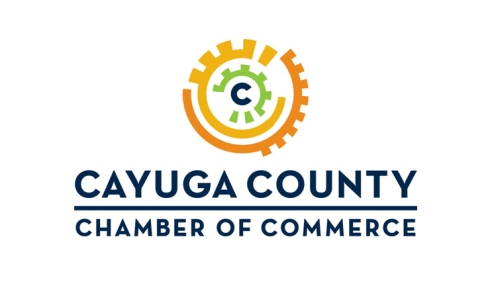
With a new executive director, new office space, and a new strategic plan, the Cayuga County Chamber of Commerce needed a newly imagined logo to let everyone know that things had changed.
In our Discovery Process, we learned that the Chamber’s constituents saw it as a social organization. But it’s really an advocacy and business development organization.
So we looked for active, bold, businesslike images, and avoided anything passive, soft, or pastoral. Our three suggested designs focused on three concepts: “Voice of the Business Community,” “County-wide Reach,” and “Collaboration.”
The Chamber went for “Collaboration.”
Our inspiration for that design came from the executive director, who told us that “the Chamber is the cog in the wheel that sets the business machine in motion.” That image set our imaginations in motion!
In the design, each wheel represents one of the three Cs of Cayuga County Chamber. The central “C” shows the Chamber at the dynamic center of things. And we chose a strong “Neutraface” font to mirror the circular shapes in the logo.
The bright, multi-color palette reflects the energy of the Chamber’s diverse membership, as well as the area it serves. Blue for the water that brings tourists to the Finger Lakes, green for the beautiful farms and forests, and oranges and yellows to illustrate the vigorous arts and culture of the area.
That beauty and energy now appears in the Cayuga Chamber of Commerce logo.
I was honored to be a guest post-er last week on Kivi’s Nonprofit Communications Blog. The title is Part II because Kivi had addressed the topic earlier in April, here.
……
I met Julia Reich at the NTC conference (at the 501 Tech NYC Happy Hour to be exact) and being the nonprofit marketing geeks we are, we started talking about the struggles that nonprofits face with design. We seemed to take a similar approach, so I asked Julia to guest blog for us. Her first post follows up on the discussion I started about style guides earlier this month by providing you with some real-life examples.
It’s not unusual that as an organization grows, your communication materials are created by various people. Before you know it, there’s five different versions of letterhead circulating around the office and your blue logo varies in shade from green to purple.
Consistency is Key. Inconsistency can be a problem. It’s crucial for a nonprofit to not only communicate their message clearly – what they do, how they do it, and who they do it for – but also to represent themselves visually in a consistent manner, so donors and other stakeholders will have an easier time recognizing your good work and understanding the case for supporting you. If you don’t communicate what your nonprofit stands for, intelligibly and distinctly, your audiences may become confused.
Style Guide Rules (or, Style Guides Rule!) Whenever my firm works on a branding project, our final deliverable is always a Graphic Design Style Guide (alternately referred to as Brand Standards or Brand Guidelines, if messaging and positioning were part of the branding process). The overarching need for such a manual is so that internally, your organization has a set of rules by which to create consistent communications collateral. The rules apply similarly to print and web usage – and Powerpoint, signage, a mug, the side of a truck, and any other media you can think of – although the specifics across media may vary. In essence, the Style Guide protects your organization’s message and your image.
Training Ensures Buy-In. Staff may need some instruction on how to implement their new style rules. For instance, along with the Style Guide, our clients receive a CD with their new logo in every possible file format necessary for usage with the above media. And while the manual explains when and where it’s appropriate to use each file, some explanation could be helpful for those not familiar with print production processes, or web standards. Training will also aid in getting everyone on board, ensuring buy-in throughout the organization for your new, or newly revised, visual identity.
Real Life Examples. Kivi’s post from April 12 was spot-on in terms of what is typically included in this document: logo usage, color palette, typefaces, and layout templates. If you’re a visual thinker like I am, it might be helpful to see examples of what this means. To that end, here are a few examples from style guides we’ve created over the years:
I’m currently enrolled in a 12-week class called The Certified Networker, held by the Referral Institute of Ithaca. In the class, I am learning how to develop relationships with people and create a referral network, which will help me grow my business. Part of this work involves enhancing my business image by developing a marketing communication strategy. This strategy includes developing a short introduction about who I am and what I do, and a longer, 10-minute presentation, which is what follows in this blog post. It should have an emotional-based marketing theme, and a call to action.
You know I am a graphic designer, and that I am owner of my business, Julia Reich Design. Let me tell you about myself and WHY I do what I do.
I grew up in NJ, in the suburbs. My father worked on Wall St. as a securities analyst, commuting over an hour each way into the city every day. I did not see him very much, and we were never very close. To this day I could not really explain to you what he did for a living. My mother (now retired), with whom I was closer, started out as a high school math teacher, eventually earning two masters degrees and becoming a learning consultant where she tested teenagers with learning problems – special ed kids – and making recommendations for appropriate schools or programs that would best serve their needs.
As a kid, my two main interests were animals, and drawing. When I went off to college, I thought I’d study to become a wildlife biologist. However, at about the same time I learned that scientists need to have an aptitude for statistics & math, I discovered environmental education – teaching nature to kids – which I loved. i was drawn towards education since i admired my mother and her career, so I went down that path, but in my own unique direction, based on my love for the outdoors.
In my 20’s, after college and then living in NYC, I was an environmental educator. In my last job in that role, I was education director of a nature center on the Hudson River. But more & more I found myself interpreting science lessons with art rather than science, culminating in an environmental & artistic tour de force that was a life-size, indoor, walk-through Hudson River marsh, that I made with my elementary school students.
Soon after, I took an evening class at the school of visual arts in NYC in graphic design, which really resonated with me. In a few more years, I left my education job to attend Pratt Institute, and got a degree in graphic design two years later.
In 2001 I started my own firm. I had worked briefly in a corporate setting, as an in-house designer, but the cubicle life was not for me. I found the hierarchies in those firms stifle creativity and meaningful personal relationships, and which make business development satisfying for me as a “solopreneur”.
Because I was familiar with the nonprofit world, this quickly became my target market, and remains to this day. I’ve had the pleasure of working with some great organizations, educational institutions, and progressive businesses: Brooklyn Botanic Garden; GrowNYC (the org which runs the famous Union Square greenmarkets); Wildlife Conservation Society; National Environmental Education Foundation; Educational Video Center; Slow Food USA; Food Systems Network NYC; Hawthorne Valley Farm. These are the ones that have missions related to my own personal interests, that I feel passionate about, and are usually the most fun to work with. And that list hasn’t changed much since I was a kid – nature, environment, animals, and similar sectors – gardening, food, and anything that could be labeled ‘green or ‘sustainable’. And of course, education.
The services I provide for these nonprofits and progressive businesses include print design (such as brochures, reports, newsletters), web design, and branding. Branding is when I design not only a logo for a client, but create their entire identity, and often also aid them with positioning and messaging – how they communicate who they are in the marketplace. This is my favorite type of work because it is strategic and involves a deep Discovery phase, which is fun, because I really get to dig deep into who a client is – figure out their personality, what’s the story they want to tell, and then translate that into visual language. Once this is established, all those other things I just mentioned – reports, business cards, websites – will need to be designed using a consistent look, feel, and message. In essence, I help organizations create their identity from the ground up, by developing their character, logo, stationery and website – a strong visual gestalt that gets carried through everything else – packaging, advertising, eBlasts, and more.
I run my design firm as a “virtual” agency. By “virtual” I don’t mean “fake” – as I have an office, in Aurora. What I mean is that I work with a collaboration of experts that I hand-pick – professionals such as designers, developers, and photographers – but they mostly work offsite. These are teams of high-level talent that are custom-assembled for each client and project. As compared to a traditional brick & mortar office – with staff – I believe the benefits of a virtual model are manifold:
• Senior level talent. Each person has at least 10 years experience, and because they are all independent consultants, it allows for a more focused application of each expert’s individual skill set.
• Flexibility. To organize a top level team and do it quickly; and to change the team from project to project.
• Personalized service. One of my clients told me recently that the large branding firm they’ve been working with for several years sent their top execs to the first few meetings, but after that, meetings and phone calls were run by staff members who did not seem to be familiar with the client or the project. With the virtual agency model, there is no bait & switch from a senior team member to a junior-level person once the project is awarded. As creative director and project manager, I am always the point person.
• Value. Since I’m dedicated to working within my client’s budget most efficiently, my virtual agency rates are more reasonable and competitive as compared to medium and big firms.
I am growing my business, and maybe you, dear reader, can help me. One of my current clients is the Cornell Small Farms Program. To work with them, I became a “preferred vendor”. Now I can work with any department or program at Cornell, so I’d like to ask – if you know someone who needs graphic design services at Cornell, or knows someone who makes these kinds of purchasing decisions, would you be willing to introduce me to them? I would welcome the opportunity to talk to them about my business and how I may be able to assist them, and would be most grateful for your referral.
Once again, I’m Julia Reich, owner of Julia Reich Design, and I help organizations tell their stories, visually.
And if we ever went for a hike together, I could also teach you to how to identify birds by their calls, plants growing along the trail, and animal tracks in the snow. Oh, and anything you’d like to know about Hudson River marshes.
I had a lovely chat today with a friend who runs the communications dept at a small liberal arts school. Among other things, we discussed summer in the Finger Lakes (wonderful but busy), local winery marketing (mostly abysmal), her design needs (bountiful yet budget conscious), and my business (growing).
She said she constantly receives materials from creative professionals such as designers and writers, and admitted that if their promotions look too good or too slick, she tosses them, assuming they are too expensive. This is eye-opening for me, since my promotional materials need to look as professional as possible in order to communicate that I am in the business of design & marketing. Yet I also work with nonprofits and businesses that are on a limited budget. I will never be the cheapest design firm out there, but nor am I the most costly. I believe in getting fairly remunerated for my work, and understand how to help my clients gain as much value as possible from our business relationship and the products and services I create for them.
So here’s the dilemma. if you receive my promotions (via direct mail or online) or visit my website, you’ll see my firm does great work. But how do I effectively communicate the value I bring to an organization or institution? How can I prevent the next Communications Director or Marketing Director or Executive Director from seeing my stuff and thinking – ‘hey that’s beautiful, but I’ll never be able to afford it’ ?
How can I help them understand that the investment they make in strong, effective brand strategy and visual communication will help them save time & money in the long run?
UPDATE, 8/9/10: I met with the organization, wrote the proposal, and my firm has been shortlisted for this project.
Lately I’ve been writing a lot of proposals, but they have not been yielding good results. I’m determined to vet the proposal-writing process more carefully, instead of jumping into it with a “nothing ventured, nothing gained” attitude, since my proposals are carefully considered and thoughtfully written, and as such, take a lot of time.
This morning, an opportunity landed on my desk, and I am trying to decide how to approach it. The RFP is for a branding project in a neighborhood in Rochester:http://southwedge.ning.com/forum/topics/seeking-proposals-for-graphic
I think my firm would be appropriate for this project because:
1. My business is located close to Rochester
2. The neighborhood in need of branding is ethnically diverse, and I have demonstrated work experience in ethnic & international sectors
3. I have strong branding experience
4. Description includes enhancing the business district, and as the President of the Aurora Arts & Merchants Association in Aurora, NY, I’m in a leadership position committed to enhancing business development in my local community
…..
OK, now here’s the red flags:
1. scope of work is undefined (“cost should include design of logo and other branding materials, such as a tagline”)
2. budget is not defined
3. RFP is publicly available; it was not submitted to my firm directly
3. and here’s the biggie: they request work on spec (“submit 2-3 project ideas”)
…..
So how to proceed – I will call with questions, for sure. Should I also request an in-person meeting? Discount it entirely since it requests work on spec?
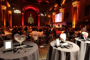
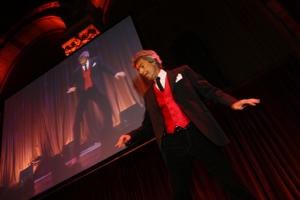
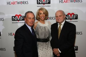
Bright lights, lofty architecture, free-flowing caviar and champagne, silent auction items in the thousands of dollars, the most dedicated and talented medical researchers and surgeons in the country, Mayor Bloomberg, and Broadway legend Tommy Tune – all came together last month in support of the National Marfan Foundation’s 10th Anniversary Gala, at Cipriani 42nd Street.
My design firm created all the collateral for the event (invitations, signage, program, and much more), so I was fortunate to be able to attend this fabulous event.
I even got to meet Hoda Kotb, news anchor with the Today Show and Dateline NBC!
About Marfan and NMF
The National Marfan Foundation is a non-profit voluntary health organization dedicated to saving lives and improving the quality of life of individuals and families affected by the Marfan syndrome.
Marfan syndrome is a connective tissue disorder that affects the heart, blood vessels, eyes, bones, joints and lungs. It is often, but not always, characterized by a tall stature and disproportionately long legs and arms. Other skeletal manifestations are curvature of the spine, a protruding or indented chest and loose joints. The most serious problem associated with the Marfan syndrome is its effect on the aorta, the main artery carrying blood away from the heart. In affected people, the aorta is prone to progressive enlargement, which can lead to tears in the aortic wall that require surgery. If aortic enlargement and tears are left undetected, the aorta may rupture, leading to sudden death.
Approximately 200,000 people in the U.S. have Marfan syndrome or a related connective tissue disorder. In most cases, the condition is inherited; one-quarter of people with Marfan syndrome are the first in their family to be affected.
While it is still too soon to gauge how successful this year’s gala was in raising funds to support for Marfan syndrome research, individuals and families affected by the disorder, and public awareness and education, in past years HeARTworks has raised nearly $7 million for The National Marfan Foundation.
Nonprofit Giving
Recent surveys show that giving has slowed – for instance, The Chronicle of Philanthropy reports that online giving, at least, continues to grow but at a slower pace. And findings from Convio’s Online Nonprofit Benchmark™ Study show “an increase in gifts drove fundraising gains” and that “Donors were still giving, but giving smaller amounts”. I myself was impressed to witness several individuals gifting BIG moola at the gala. Is recession relief in sight?
Design of the Gala Materials
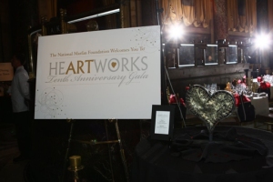
NMF approached me to design their gala materials because they knew about our reputation working in the nonprofit sector. They showed me past years’ gala materials with the request that this year, the 10th Anniversary design needed to be more polished, more corporate, more festive. After presenting them with several options, the invitation design they chose featured celebratory fireworks bursting forth with hearts (hearts are a long-standing theme for the NMF gala) and stars. The invitation was printed in gold and silver foil on thick paper stock with a gorgeous column texture, and placed in a gold metallic outer envelope. All the other collateral for and at the event – down to the placeholder slide on the overhead screen and above the stage at Cipriani’s – utilized this same look and feel to achieve a branded consistency that felt worthy of a gala with seats starting at $500.
I care about the causes my firm promotes, and find meaning in the work beyond monetary rewards. My clients trust Julia Reich Design to help them achieve their mission, in many cases as long-term partners, since our values are aligned. I understand the clients served by my firm because I’ve been on “their side” – prior to starting my company I was an environmental educator who worked for various nonprofit education centers and museums. Through my company, I help organizations like National Marfan Foundation tell their story so they can have greater impact with their audience.
Kudos
“The materials you designed for our 10th Anniversary Heartworks Gala truly achieved the look we were hoping for! We received so much positive feedback from our guests – the fun and festive, yet elegant design really helped to convey the feel of the evening. We were so pleased with the results, and felt that changing the design used in previous years helped create new interest and peak the interest of those that have been supporters for years.”
—Kristin Braun, Development Associate, National Marfan Foundation
PHOTO CREDITS: Timothy D. Joyce
I just learned this morning that I did not win a juicy design and branding project that I submitted a proposal for, in response to an RFP, and am bitterly disappointed. I feel I was an extremely strong candidate – well-qualified to handle the work, with a strong creative portfolio. This was a project in the tourism sector and included a “quality of life” brochure series; new county-wide brand identity for this central New York region; and a web site portal that would be utilized by several city and county agencies.
When I do not win a project, the first thing I do is ask the prospect why. Do you do that? It’s very useful. I promptly picked up the phone to discuss the matter with the agency leading the search, and was able to learn some things about how the committee made their decision and also how I can improve my proposals for the future. Our talk also led to some unanswered questions, so if you have any insight I’d really like to hear from you.
I learned that the committee – made up of reps from various city and county agencies – used a fair, thorough methodology to score candidates, consisting of categories and a point system. The decision was not based on price. Apparently I came pretty close to the top three firms that made the cut (I came in fourth).
In an ideal world, after I submit a proposal, I should be able to meet with the committee making the decision in order to discuss and answer questions. In this case, unfortunately, insisting on an in-person meeting was just out of the question. Because I was not able to talk to them, I’m afraid they made some assumptions about my work and my proposal that I was not able to defend:
• the committee questioned my ability to handle the research necessary to complete the branding portion because they thought Julia Reich Design consists of just one person – me – even though I emphasize “my creative team” in the cover letter. Which leads me to wonder if I need to change the name of my company. Does using my name make it sound like I am just one person?
• the RFP requested copywriting & photography services, and I received low marks here. Why, I wanted to know? I do not offer these services in-house so I included names, websites, and ballpark pricing of two highly talented creative freelancers in the area that I have worked with before, that I would hire as sub-contractors for the project team. Since the scope of work in the RFP for this portion of the project was as-yet undefined, I provided hourly rates for these services and indicated that in some cases, the fees were TBD. How did the firms that made it to the next level include these services? I discovered that they provided a fee range (for instance, $1200-$1800), and made it look like these services were provided in-house. The committee may have appreciated the apparent “ease” that comes with hiring a design firm which provides “the whole package”. Lesson learned – next time, I will do the same, and save the specifics of each creative team member for the interview stage. How do you list sub-contractors in your proposals?
• finally, even though I submitted a strong portfolio showcasing several brand identity projects I have done, I found out that the committee chose other firms over mine because of the recognizability of the other projects. In other words, the decision-makers had seen the other firms’ work previously in the local central New York community – while much of my client base is in New York City. I am not sure what to do about this. Like McDonalds, is the familiar always preferable? I moved to this small community 2.5 years ago from New York City, and have thrown myself into all sorts of community endeavors and taken on leadership positions in local organizations. In spite of this, are they suspicious of perceived outsiders? Should I take this as a lesson to re-focus my efforts back to metro New York?
……
Of course, there’s no guarantee that the changes I make in my next proposal, based on the lessons I learned from all of this, will win me the next project. But I’m glad I made the effort to call my contact to communicate about the decision rather than fuming silently in my office.
Have you lost a project recently? What would you do differently next time?
– and Julia Reich Design created their new look!
The agency that brings you the famous Union Square Greenmarket and a host of other city-wide environmental initiatives unveiled their new name and newly-designed suite of logos late last week. Learn why, after 40 years, Council on the Environment of New York City opted for a fresh look here.
The apple is the iconic symbol of New York City, and the style in which it is rendered directly references the organization’s own iconic Greenmarket apple. To create a cohesive package, each of their programs received its own “sub-logo” (below). These are visually branded to remain consistent with the main umbrella logo, above.









Recent Comments